Data Visualization#
One of the greatest benefits from having a web user interface (UI) is the great flexibility it provides without having to install any special software and the data is downloaded through channels we use in our everyday life.
Understanding the UI#
We will go into details later but for now this is what you see most of the time. It is meant to be simple to understand but we will go into explaining every part.
Data detailed view.#
Search view, implements some filtering functions.#
For a detailed exploration we will divide the view in several subsections, for their global position please consider the following image.
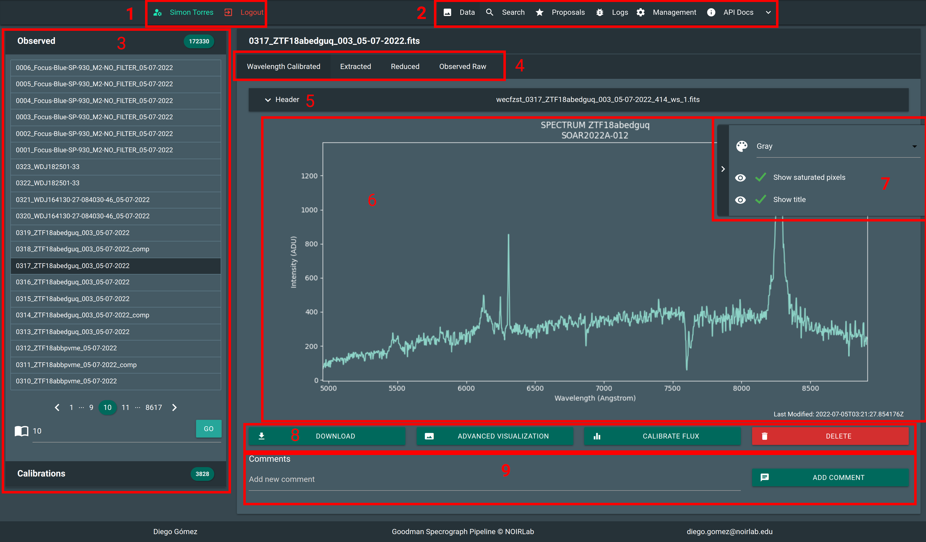
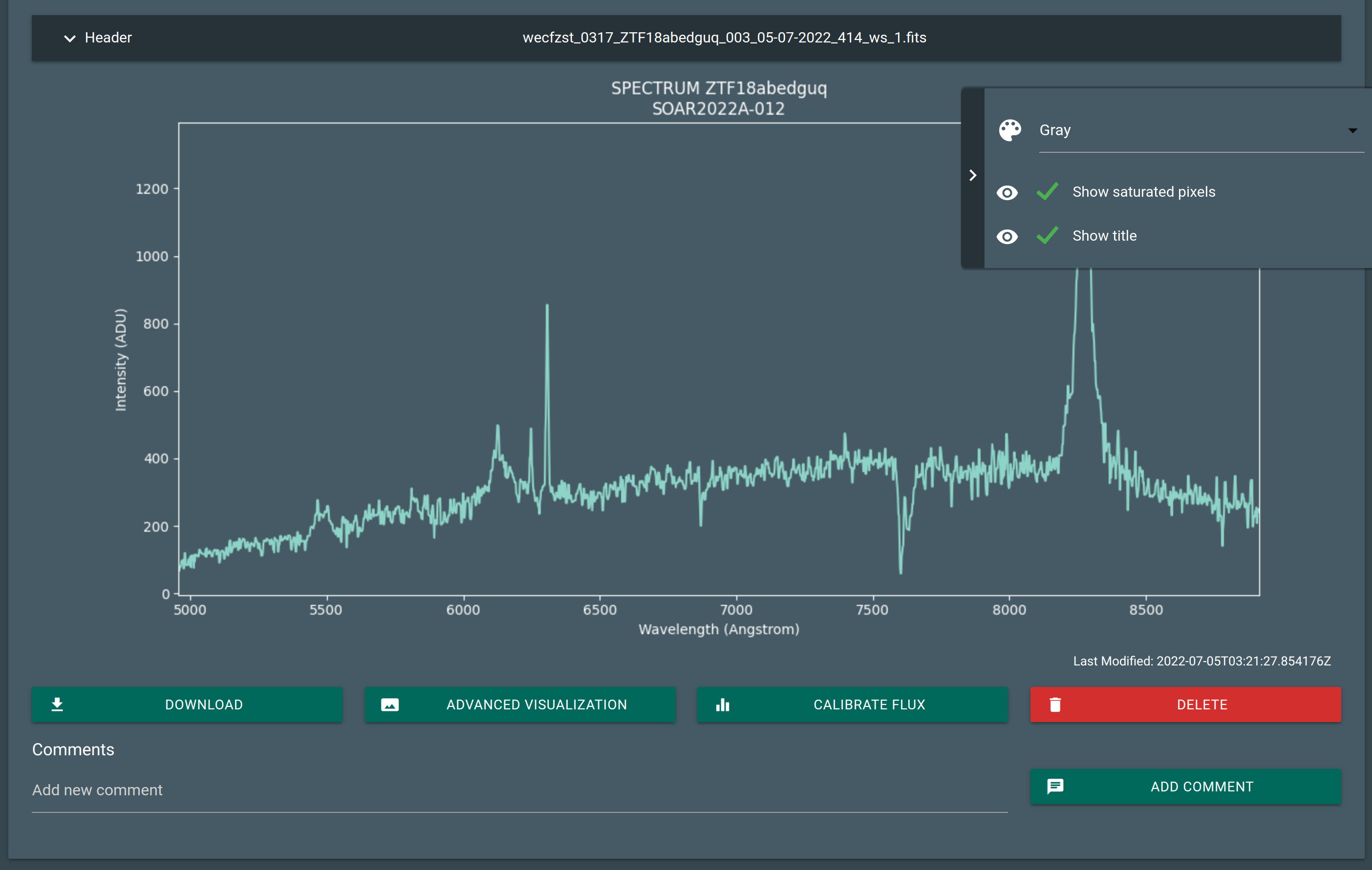
Detail: 1. Access to user controls and information. 2. Main navigation bar. 3. Quick access to files. 4. Related or child files. 5. Toggle header view. 6. Visualization area. 7. Visualization options. 8. Contextual actions. 9. Comments.#
Main Navigation Bar#

An always present navigation bar allows you to access:
- Data Visualization
The view were you can visualize data as it arrives as well as trigger actions.
- Search
Changes to Search view and implements filters.
- Proposals
Where you can see the proposals details, such as Title, Abstract, Principal Investigator and Collaborators. Also you can add or delete collaborators and edit the Data Reduction Settings.
- Logs
Important log messages, not very detailed but the most relevants.
- Management Menu
This is for staff users only and will be explained in the staff chapter.
- API Docs
Contains the documentation of the Public API in case you want to develop your own tools.
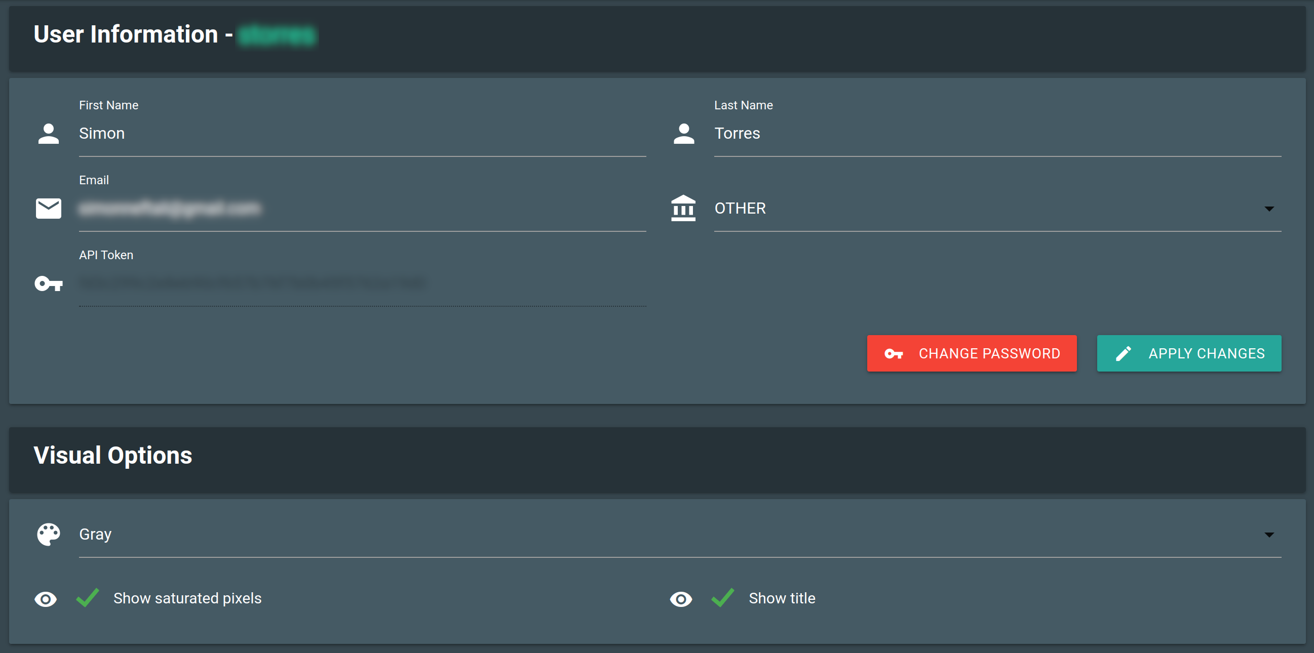
User Controls#
By clicking the username button you get access to some user details and settings. Also you can change some preferences.
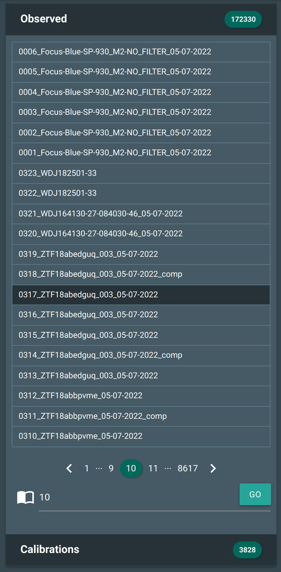
File Index#
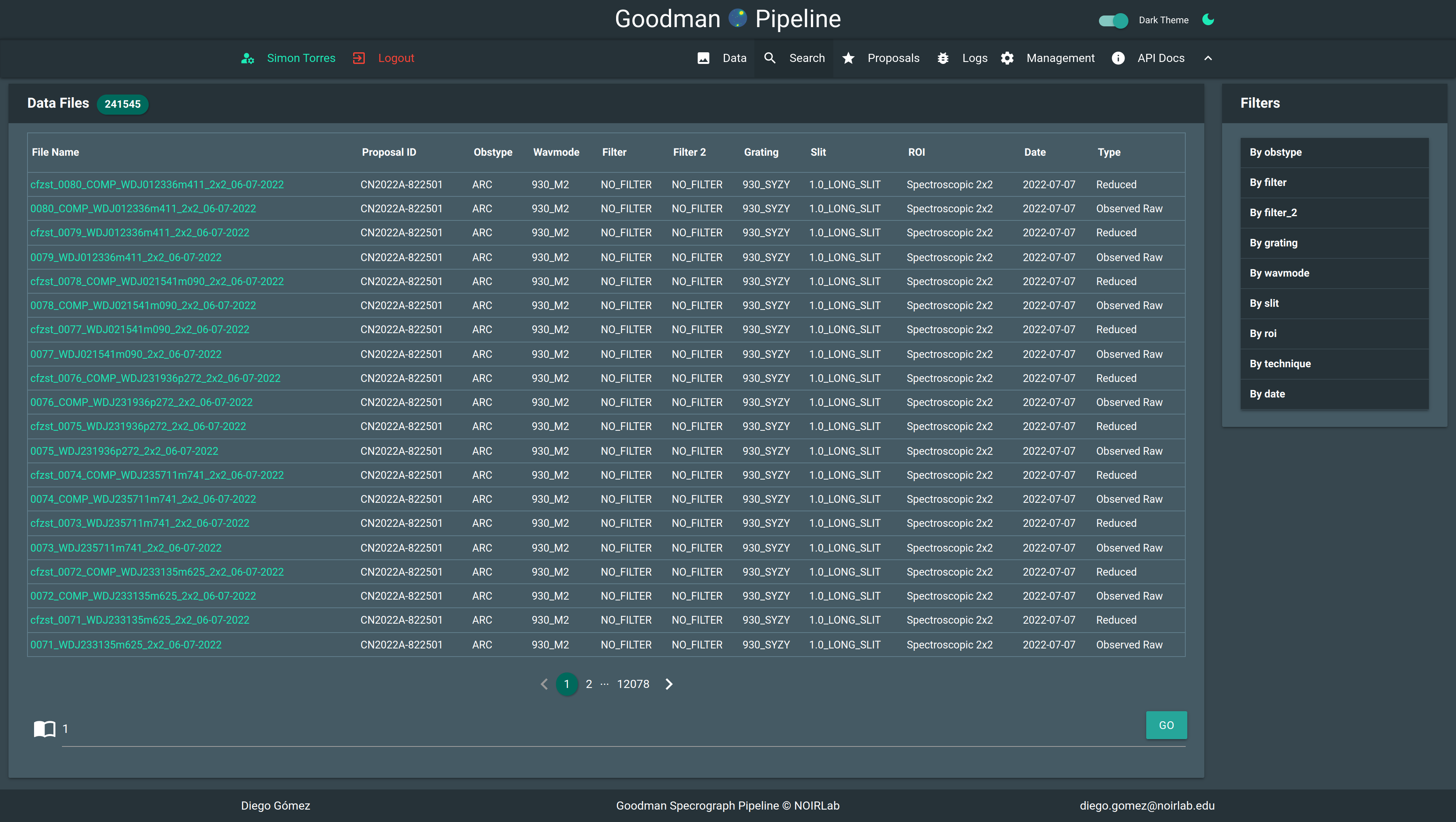
This area allows you to navigate the files, they are ordered from newest to oldest, if you want to filter the data you should go to Search.
In this area you can also see only combined calibration files such as, master BIAS and master FLAT, those
are visible to everyone.
Related Files#

All files are indexed by its raw parent file. Every file that was derived from that parent it is treated as child and are listed along this section. The buttons are tab handles.
Header#
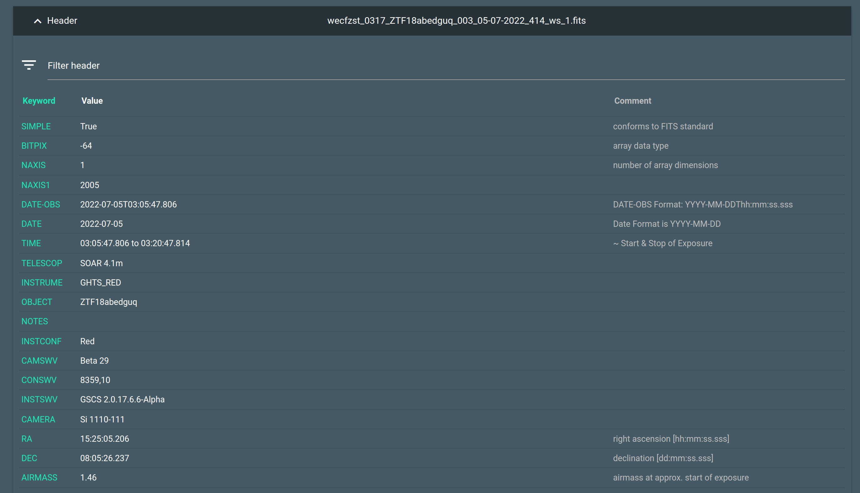
Will make the header visible in a searchable table.
Visualization Choices#
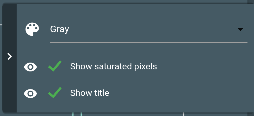
Allows to select a different color map for images, show or not saturated pixels and an image title.
Contextual Actions#

This area is where you can trigger actions.
- Download
For download the FITS file.
- Advanced Visualization
Takes you to another view where you can adjust the sampling limits for images. Or change the color map.
- Calibrate Flux
It’s an action that changes according the type of file that is on display. For instance for a raw file will be Reduce Raw File.
- Delete
Only possible for processed files. Raw files can’t be deleted.
Visualization Area#
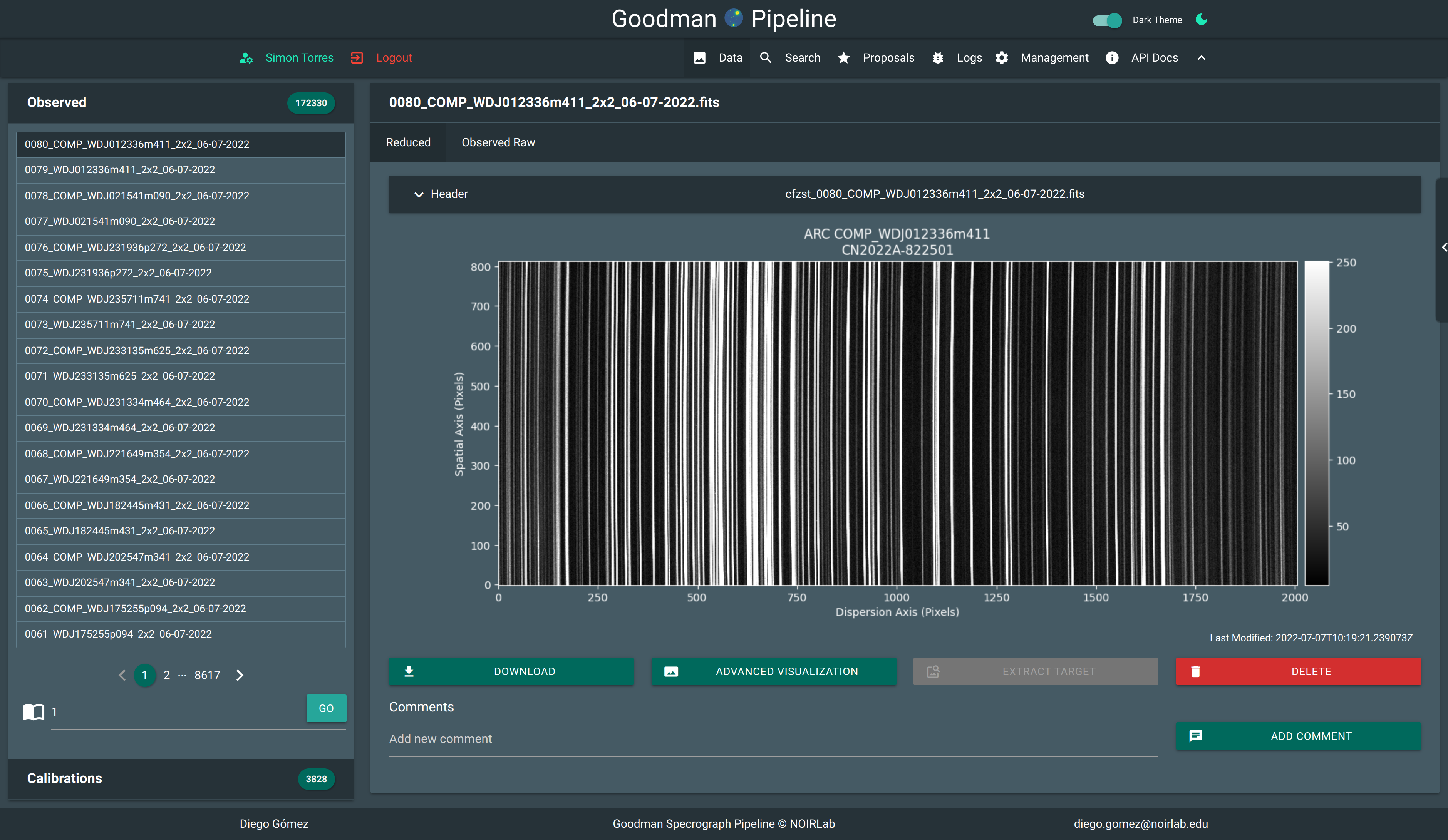
Example of a static data visualization.#
In this area you see the plots or the images. There is an interactive way that uses Bokeh but is slower. and for now it only allows you to zoom in or out.